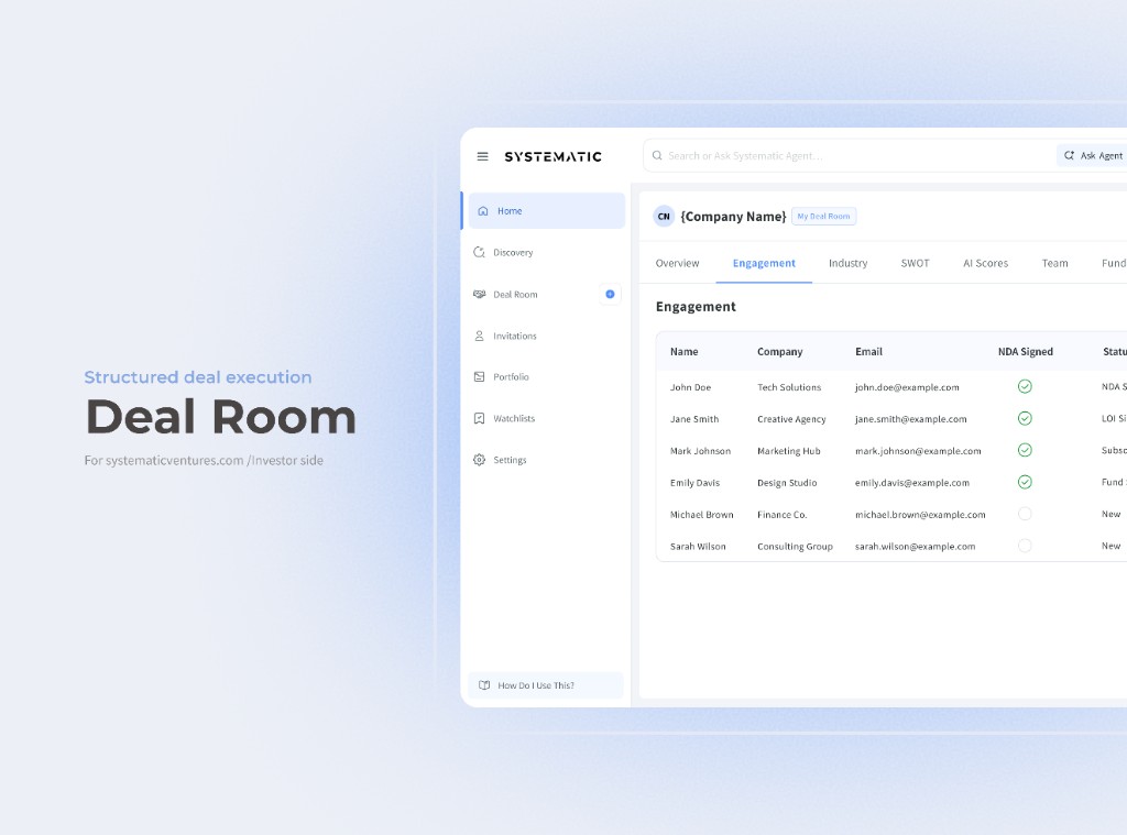
Systematic is a US fintech platform for investors to discover, evaluate, and track companies - one place instead of scattered Excel workflows.

Designing a context-aware AI system that helps investors move from information overload to confident decisions.
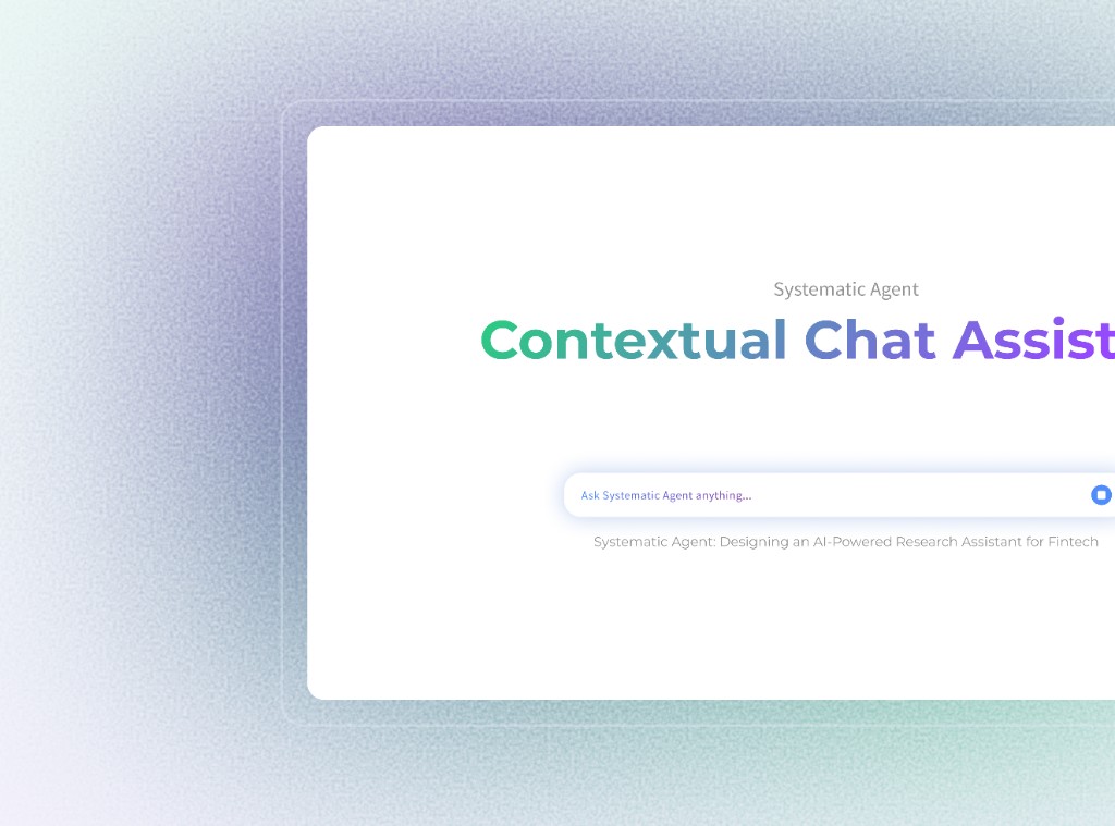
A fintech platform where the data was never the problem but getting investors to trust it and act on it was.
Systematic is a US fintech platform for investors to discover, evaluate, and track companies - one place instead of scattered Excel workflows.
Product Designer & UX Researcher. I owned research through UI and handoff, and kept product, data, and ML aligned.
Investors had data, but not a clear next step. Rigid search and long manual evaluation led to analysis paralysis - and abandoned sessions.
A two-part AI system: chat for discovery, and auto-generated insights for evaluation. Discovery got 3× faster; CSAT hit 85%.
Investors weren't failing because of bad data. They were failing because the interface demanded precision they didn't yet have.
This wasn’t only a UX fix - faster time-to-insight became a real product advantage for retention and willingness to pay.
The typical investor research journey
01
Confused↳ No results matched intent
Investors typed broad terms like "innovative fintech" - but the database only matched exact strings. Results were either too broad or empty.
02
Overwhelmed↳ 40+ parameters, no guidance
Filters existed for sector, revenue, geography, growth rate - but users didn't know which parameters mattered for their thesis.
03
Stuck↳ No way to evaluate quickly
Even after finding companies, there was no quick way to understand fit. Users manually read 10–15 profiles before shortlisting anyone.
Analysis Paralysis
Too many options. Not enough signal. No path forward.
12+
profiles opened
Investors opened 12+ profiles before shortlisting even one company.
73%
sessions ended without a decision
Nearly 3 in 4 sessions ended with no shortlist - just closed tabs.
"Investors didn’t lack data - they couldn’t turn instinct into a query. The UI asked for precision before they had it."
45–90 min
avg. time to evaluate one company
5–7 tabs
opened per research session
73%
sessions ended without a shortlist
0
tools that understood investment language
Keyword search felt like “looking for a needle in a haystack where the needle is invisible.”
"I don't know what I'm looking for until I see a pattern, but I can't see the pattern because I don't know what to search for."
Institutional Investor, Series B
"Filtering is too rigid. If my criteria is 'innovative' but the database only has 'R&D spend', I miss the nuance entirely."
Angel Investor, Tech Focus
"I spend more time configuring filters than actually evaluating companies. The tool is supposed to help me move faster - it does the opposite."
VC Partner, Growth Stage
"The search returns names. What I need is context - stage, traction, why it's even relevant to my current thesis. None of that comes through."
Investment Associate, Early-stage VC
"By the time I've gathered enough signal to feel confident making an intro, someone else already closed the round."
Managing Director, PE Fund
18
User Interviews
6
Stakeholder Sessions
3
Usability Tests
No guidance or intent recognition - every session started from zero.
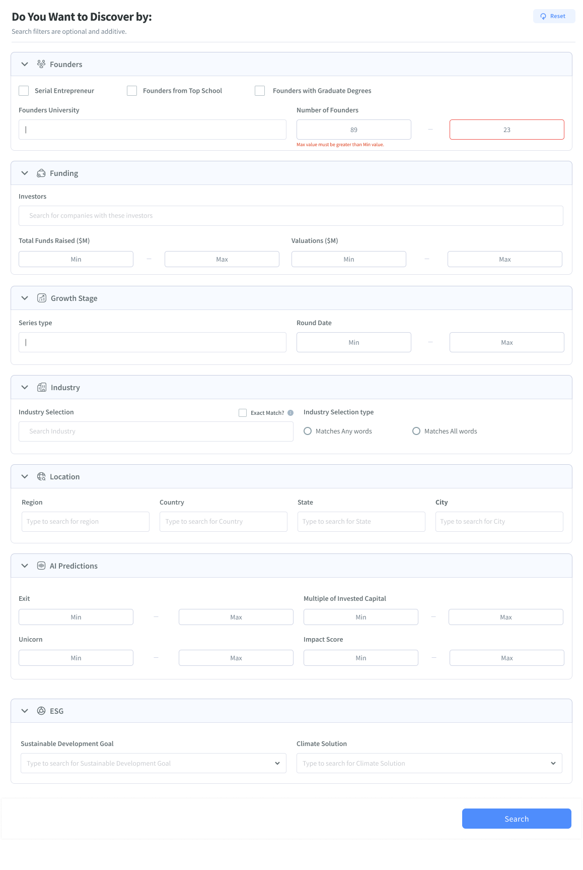
40+ filters with no hierarchy or investment-aware grouping.
Flat, cluttered rows - little signal, no AI synthesis.
"The average session involved 3 separate screens, 20+ minutes, and still ended without a shortlist."
- Synthesised from 18 user interviews

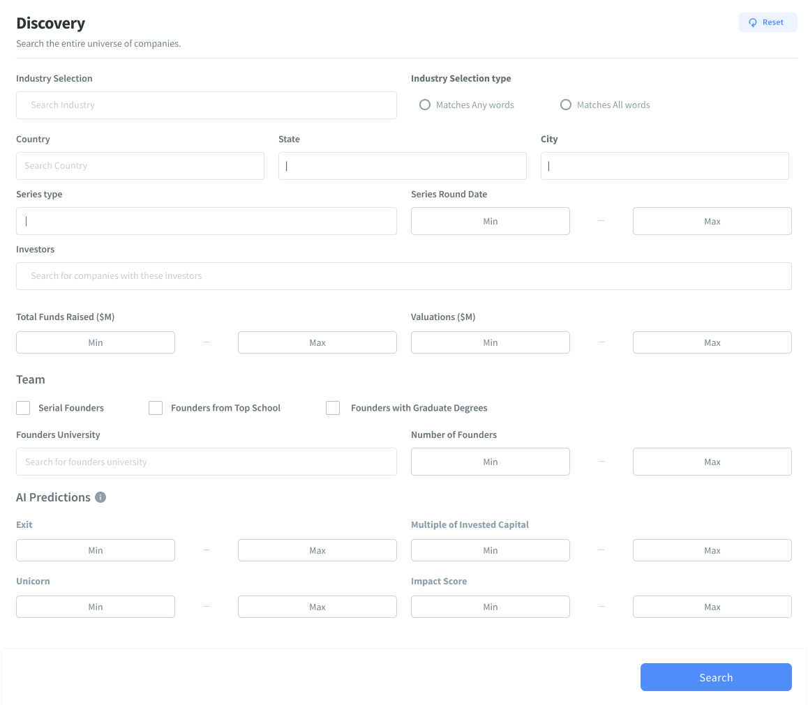
What exists today - and where the gap still is.
Approach: Keyword search + rigid filters
Failure Point: Users don't know what to filter for
Systematic Edge: AI-driven discovery
Approach: Conversational, open-ended
Failure Point: Hard to compare or structure
Systematic Edge: Structured AI insights
Approach: Parameter-first filtering
Failure Point: Requires upfront knowledge
Systematic Edge: Context-aware suggestions
Mapping the funnel showed the real pain wasn’t at the top - it was in the middle.
Investor states intent in keywords or plain language
Users refine by sector, growth, geography, and more
Where AI insights can cut the manual work
Save and organize promising companies to compare
Final check with structured data before deciding
Friction Peak: Stage 3 - Insight Evaluation.
This is where investors stall: a shortlist, but no fast way to judge fit. They read profiles, jump tabs, and still feel unsure. It’s a synthesis problem, not a data problem.
We didn’t jump straight to chat. We fully explored three directions first.
Smarter filter groups, saved templates, and contextual tooltips.
For
Against
DecisionFilters demand precision. Our users didn't have it yet.
Home-screen recommendations from portfolio and behaviour signals.
For
Against
DecisionGood for retention loop, not for initial discovery. Parked for Phase 2.
Natural language that maps investor intent to company data in real time.
For
Against
DecisionBest fit. Investors explore before they can specify. Chat mirrors that naturally.
We chose exploration over perfect precision so investors could start without knowing every filter.
We chose explainability over full autonomy - showing why companies surfaced, to earn trust.
We shipped chat as an overlay and kept classic search as a fallback - lower adoption risk while the new flow proved itself.
Good design is also what you choose not to ship - and why.
Only 8 weeks to ship
A board deadline meant design, research, and build had to run in parallel.
High Impact
We tested with real users in Week 3 - imperfect, but fast enough to steer the work.
The AI wasn't fully ready yet
Early AI accuracy sat around 74% - good on many queries, wrong often enough to plan for.
Design Workaround
We designed for imperfect AI: show confidence, and make it easy to rephrase.
Engineering had limited capacity
Chat and search shared a backend. New ML work competed with an already stretched team.
MVP Scope Cut
v1 stayed simple and reused what we had. Cross-session memory waited for a later release.
Each part targets a specific friction we saw in the funnel.
The funnel showed discovery friction at Stages 1–2 and evaluation friction at Stage 3. Instead of one catch-all fix, we built two complementary systems.
Search stage · Analysis paralysis
Conversational DiscoveryKey Features
Impact: from blank-slate anxiety to confident exploration in under 60 seconds.
Evaluation stage · Manual synthesis
AI Insights EngineKey Features
Impact: turns a ~2-hour profile read into a ~10-minute structured evaluation.
Each version taught us something. We cut what stalled discovery and shipped what matched how investors actually work.
Empty panel with only a Let’s Chat CTA - no prompts or history.
Removed: the blank slate left investors unsure how to start.

Prompt chips helped entry, but the body stayed empty with no session structure.
Removed: better start, still weak for ongoing research.

History sidebar and table answers helped, but topics were placeholders and the overlay still felt heavy.
Removed: closer structurally, not trusted enough for diligence yet.

Real history, sourced insight cards, loading states, and search/agent in the top nav.
Selected: it matched how investors explore and build conviction in-flow.

Key moments where users begin interactions and access information.


Land on a search results page, OR Initiate an AI-driven chat by clicking “Ask Systematic Answers.”

Launches the search interface.


Shows recent searches when available - or lets people type and jump into AI chat.
Ask Agent shows a bell + highlight so updates don’t interrupt the current flow.


Collapse · History · New Chat
Supports: Text, Tables, and Links.
“View all” opens the relevant profile tab.
Resets conversation state
Retains ability to access previous history
Jumps to the latest message; older ones stay scrollable.
History icon opens the sidebar.
Rename · Delete
Long histories don’t dump everything at once.


Free users get a small weekly allowance (and a hard total cap). Paid and trial users get unlimited chats.
We show a clear banner before and after each chat, so limits never feel like a surprise dead end.
A few details that kept the chat feeling useful, not generic:


AI Insights live on the company profile - so evaluation is faster and clearer.
Users can quickly skim before diving deep.
Organized panels, not open-ended chat.
Progressive disclosure reduces overwhelm.
Less manual synthesis, without hiding the deeper data.
Better context → better insights → higher trust → better decisions
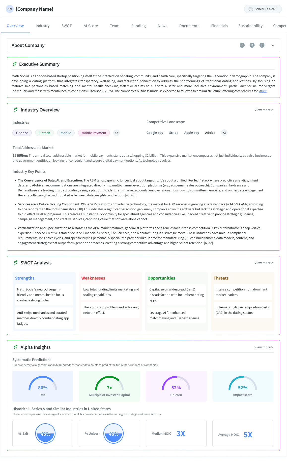
One profile redesign covered hierarchy, readability, AI explainability, trust, and decision support.
NeuralFlow Inc.
Artificial Intelligence · San Francisco · Founded 2019
Unstructured wall of profile text with no scannable hierarchy across overview content.
Investment Potential - see Financials tab for more
NeuralFlow builds real-time ML inference infra. Strong NRR, growing enterprise deals, and efficient growth point to clear product-market fit.
AI confidence: High · Based on verified data · View sources
Pick companies from results and compare them side by side - including an AI fit score tied to the original thesis.
| Metric | NeuralFlow Top Pick | DataSphere | LogixAI |
|---|---|---|---|
| Stage | Series B | Series A | Seed |
| ARR | $12M | $4.2M | $820K |
| NRR | 142% | 118% | 95% |
| Risk | Low | Medium | High |
| AI Fit | 92% | 74% | 48% |
Two test rounds with investors surfaced the issues that drove the biggest design changes.
Unmoderated Figma test with 6 internal users. Three tasks.
45-min moderated sessions with 8 investors on staging. Think-aloud.
Blank chat input caused paralysis
4 of 6 users in Round 1 stalled at the empty chat input for 15+ seconds. The open-ended "Ask anything" prompt was too vague for professional users with a specific research context.
We assumed investors would know how to start. They didn't.
Added contextual prompt suggestions (3 pre-filled query starters based on user role). Redesigned empty state to feel like an invitation, not a blank form.
Validated in next round
AI response format was unreadable at speed
In Round 2, investors wanted to scan results in under 10 seconds. Prose-style AI responses required reading, not scanning - users skipped them entirely and went straight to the company list.
We over-indexed on narrative response quality and under-indexed on scan-ability.
Restructured all AI responses to lead with a bolded summary line followed by scannable bullets. Tables replaced prose for comparative data.
Validated in next round
"New Chat" created unexpected anxiety
3 users hesitated before clicking "New Chat" - they feared losing the current context or search history. One user said: "If I start over, I lose everything I've done."
The "New Chat" interaction was treated as a reset, not as a fork.
Added a confirmation tooltip ("Your history is saved - this just starts a fresh thread") and ensured history sidebar was always visible before the action. Renamed to "Start new thread."
Validated in next round
AI Insights panel felt disconnected from company data
Users praised the AI insight summary but then struggled to reconcile it with raw data in other tabs. They wanted to fact-check - but the path back was unclear.
We didn't bridge the gap between AI synthesis and raw data trust.
Added inline "See source data" links within the insight panel. Each AI claim now links to the specific tab and section where the underlying data lives.
Validated in next round
"We didn’t test to confirm our assumptions - we tested to break them. The best findings came when investors did something unexpected."
SUS Score
Out of 100 · usability rose after the empty-state and scan fixes
Task Completion
More investors finished the flow without getting stuck
Time on Task
Shorter green = faster task · nearly half the time
From friction to a calmer, faster flow.
Existing experience
High Friction→ High load, slow decisions, low confidence
Systematic Agent
Confident FlowReduced load. Faster, more confident decisions.
High Friction → Design Transformation → Confident Flow
How I drove alignment and cut through ambiguity with the team.
Weekly scope and priority sync. I owned design strategy; PM owned business framing.
Joined bi-weekly ML reviews and turned user needs into API constraints early - less rework later.
Partnered with data to pick insight signals investors actually use - not vanity metrics.
What the numbers meant for users - and for the business.
40%
Reduction in cognitive loadConfident shortlisting in under 3 minutes - down from about 8.
+12%
User retentionInvestors who used to churn after ~2 sessions started coming back weekly.
3x
Faster discoveryQuery-to-insight went from ~2 hours to about 35 minutes.
85%
User satisfaction (CSAT)CSAT rose mainly from transparent AI and structured summaries - people could see the reasoning.
What worked, what I’d change, and where this goes next.
Mapping the journey before UI work showed evaluation - not discovery - was the real bottleneck. That reframe shaped everything after.
Chat was the headline, but keeping keyword search cut adoption risk. Nobody was forced into a new paradigm on day one.
Source links weren’t optional. Professionals needed the reasoning, not just the conclusion.
We underestimated how hard the first chat felt - even for experts. Earlier empty-state tests would have saved a full iteration.
We researched with users, then ideated alone. Co-design with 2–3 investors earlier would have unlocked the “natural language thesis” insight sooner.
We tracked CSAT and retention, but “AI confidence” only became a KPI midstream. Defining it earlier would have focused the trust work.
Go from reactive chat to proactive signals - e.g. new funding on companies that match your last query. Search becomes intelligence.
Bring insights up to portfolio level - overlaps, risks, and diversification across holdings.
Support team research: shared chats, comments on insights, co-shortlisting. Decisions rarely happen alone.
"The biggest decision wasn’t the chat UI - it was reframing the problem from ‘better search’ to ‘lower cost of forming a view.’ That changed everything."